A spin on sun rays, literally | Color Me Scrappy Challenge | { 10 months }
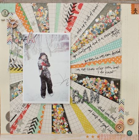
Sun rays have been hugely popular in the scrapbooking world. Some examples:
I really like Laura Vegas’ page above (2nd example), and decided to try the pattern. The funny thing was I didn’t look up the examples when I was ready to create the page, I just had a vague idea from browsing this page weeks before that, and my page looks strikingly similar as if I scraplifted it with the image in front of me. I guess there are only so many things you can do with sun rays. You either use it on the entire background, or 1/3 of the layout.
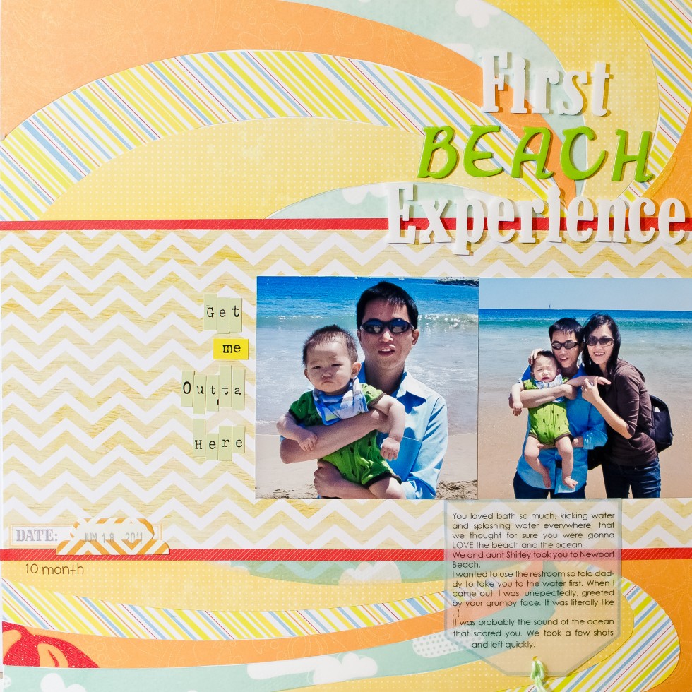
At any rate, since my photos are about the beach and the ocean, I wanted to make my sun rays like waves. So I decided to curve them. My first try was drawing a bunch of curve lines in Illustrator and smoothed them out using the pen tool. But I didn’t think the curves were consistent. They’ll look like I free cut them by hand.
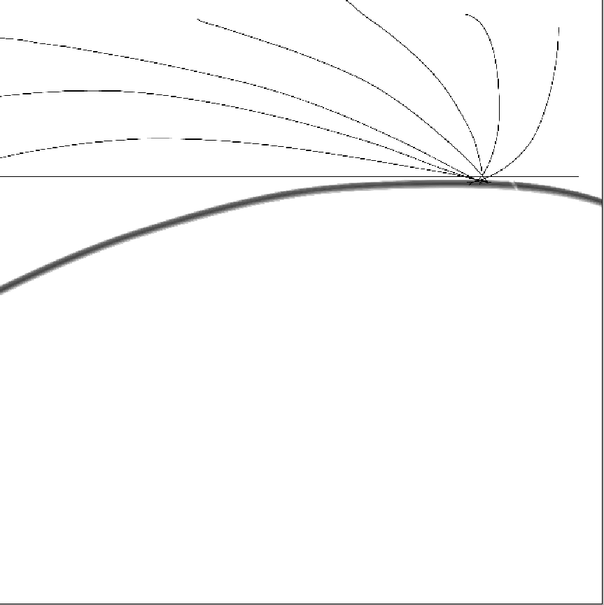
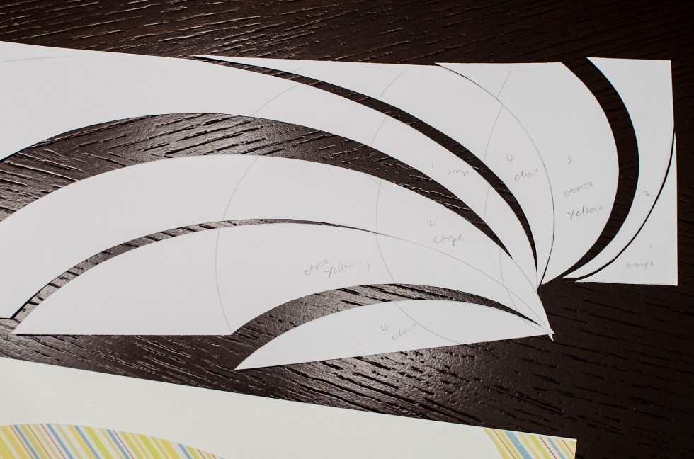
I decided to draw a bunch of ellipses in InDesign to get the perfect curvature that look more uniform, and I liked how they turned out:
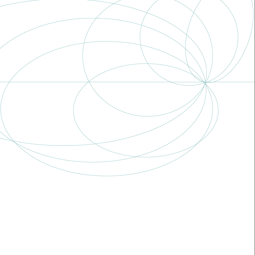
I printed them, labeling which pattern paper goes where, and then hand cut them.
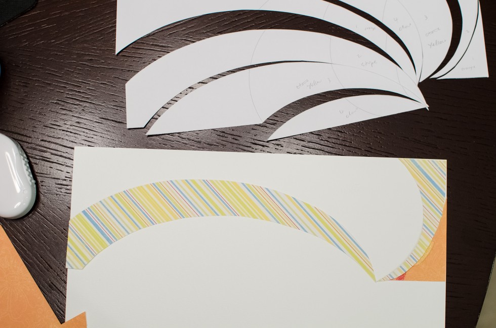
I traced the back pieces onto the back of pattern papers. I almost made a mistake and flipped the design horizontally, which would be horrible because I really wanted the center of my swirls to be on the right, not on the left. If you want to try this, make sure when tracing the cut piece, the penciled-in side (the right side) faces down onto the back of the pattern paper. Or else your design will flip horizontally. I hope I make sense. If not, just visualize that you have a cut-off number 6, trace it onto a back of pattern paper with the right side of the 6 facing you. When you flip over the pattern paper, you’ll have a reverse 6.
I need to take more WIP photos next time instead of explaining in so many words!
Then arranged the pieces on the cardstock.
Repeat the whole process for the bottom. Then I created the journaling tag. It was pretty easy to create the tag shape in photoshop, and just added the border and printed it on vellum.
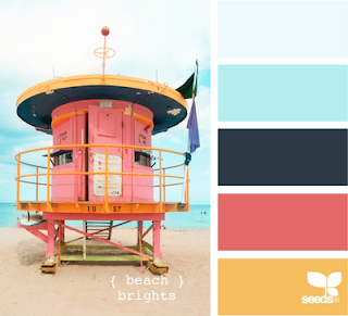
I’m also submitting this to the first color challenge over at Color Me Scrappy. Look at the fun inspiration, how summery and cheerful:
Journaling:
You loved bath so much, kicking water and splashing water everywhere, that we thought for sure you were gonna LOVE the beach and the ocean.
We and aunt Shirley took you to Newport Beach.
I wanted to use the restroom so told daddy to take you to the water first. When I came out, I was, unepectedly, greeted by your grumpy face. It was literally : (
We guessed it was the sound of the ocean that scared you. We took a few shots and left quickly.
& -DCWV Citrus Stack





Hehe! I love your ‘spin’ on the sun rays. ;)
Very cute layout!
I also love that clear journaling spot!
LOVE, LOVE, LOVE!!!!!!!!
Adorable layout…love the colors.
Fantastic twist on a concept! The soft colors just flow and don’t dominate the photos. Beautiful work!
Great examples! I have seen both before and love them.
You did a great job making it your own!!
Love the swirl effect :)
Awesome job!
I love your elliptical sun rays! Great tip! Lovely layout!
Love your version! The first layout is by Garden Girl Lisa Truesdell by the way! :-)
Thank you, Dee! I updated my post.
How cool, I love your twist on the sun rays!
Oh preplanning pages is such a good idea…sure wish I’d do it more! I love this layout and I love how you made your rays more elliptical.
Your layout is lovely.
Adorable photos. I know a lot of little ones don’t like the sand on their feet.
You asked a question on my blog, yes my husband got the pages printed in IPhoto, or where ever Apple sends them to get printed.
Wow, love your take on the swirls, such great movement!
Love your take on the sunrays! Wonderful!
LOL. That expression is so funny. Poor little guy. Hopefully he will learn to love the beach.
AMAZING !!!
your LO is so nice !!! And i like the fact that you did the “spirals” at the top AND at the bottom of your LO
lovely colours and really nice pics !!