Mother’s Day Card
I’m not a card maker. The last card I made was probably when I was in the 2nd grade with a hand-drawn carnation for my mom. But ever since I started scrapbooking, I toyed with the idea here and there. Why not? I have a lot of scraps from my 12 x 12 layouts. The scraps are a pain to keep, but too wasteful to toss. Besides, buying ready-made hallmark cards seems lacking in sincerity and is waste of resource too, because the recipients generally don’t keep the cards more than a day or two.
The best first card-making occasion has to be mother’s day. They love us and would be thrilled to get anything handmade from us, and will shower us with compliments… I hope. I knew immediately I wanted to use this flower I saw from Kesi’Art as the center piece. And the rest should just fall into place. Easy peacey! That brewed in my mind for weeks, and I finally started on the project at 2am after being woken by my son, thinking I could finish it within an hour or so and crawl back to bed.
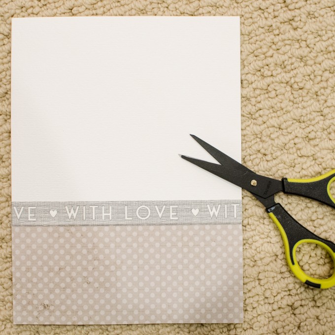
How wrong was I! It’s so foreign to design on such a small space with no photos. The flower was easy to make, taking merely minutes. I sectioned the card off with a pattern paper and wash tape, something I often do with 12 x 12 layouts.
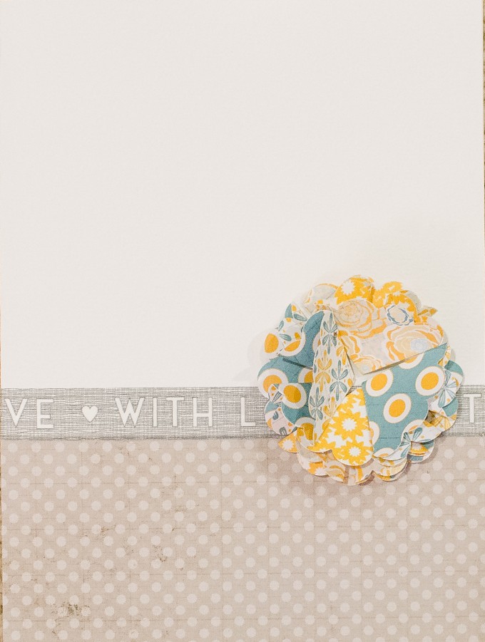
Then when I put the flower on the card, it didn’t look right. I tried various placements, top center, right 1/3, bottom 1/3, but nothing looked right.
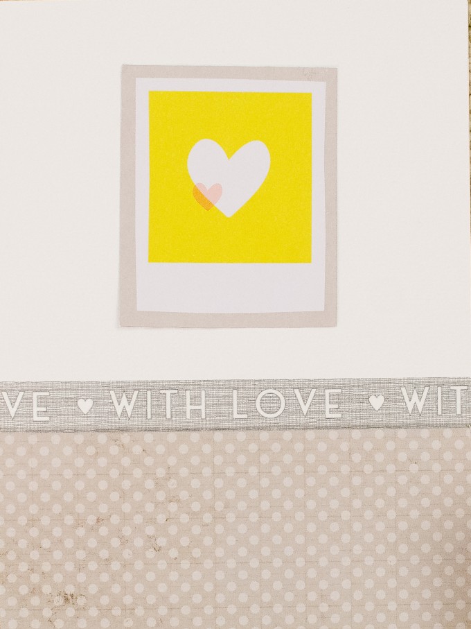
Then I tried other center piece idea. It looked more right, composition wise, but it didn’t look like anything special.
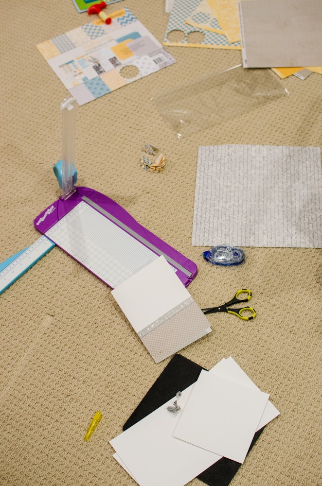
After a few hours, I gave up and went to bed, continuing the thoughts in my dreams, leaving my working floor looking like this. Just needed to make sure I tidy it up the next day before my toddler gets to it –
The next morning, I realized that the problem was the proportion of the card to the flower, and the plainness of the top part. I cut the card to a smaller size and stamped the top half, and it looked much better. Here’s the final result:
It’s interesting how even though the design concept is the same, designing for a card and 12 x 12 layout can feel this different. I felt like a newbie all over again. It’s a little like learning to drive in a car and when driving another car for the first time, you feel like you are relearning all over again.
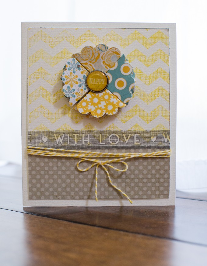
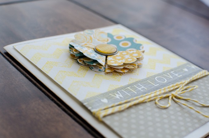
Supplies:


I love seeing your creative process. You did a great job!
Love the end result. I have a hard time working on a small space too. I’m so used to 12×12 that anything smaller scares me!
It really is beautiful. I’m mainly a card maker and am very comfortable with working on that size. But I go through exactly what you describe when I scrapbook on 12 x 12. Thanks for sharing your process. It’s good to know someone else does the same!
I think it turned out beautifully. I am not much of a card maker either but it’s a great way to use up scraps. I do like to use cards as a warm up – if I am not in a crafty mood but need to get some things done, I’ll start out with a card. The smaller landscape makes it easier to finish. It usually gets me into a creative mind set. I will also make cards with all the leftover scraps on my table if I have time. You may find that you do this more and more too! :)
No criticism here! I think it’s beautiful!
I think centering the flower definitely helped :)
Really beautiful card. Love the colors.
This is very pretty!
This is soooooo super! I just love the design!
Thanks so much for stopping by my blog today and taking the time to write such a kind comment. I would be honored if you stopped by again sometime or even signed up to follow and i would do the same! thanks again
mp
I love it! I am not a card maker either, but looks like you are!!!!
I love it , your card is so nice, elegant, beautiful, simple and pure !!!!
you are good at it, you should make more of then !!