Two Ways to Use 6×6 Paper On A 12×12 Layout, Part 1 – { 11 Months }
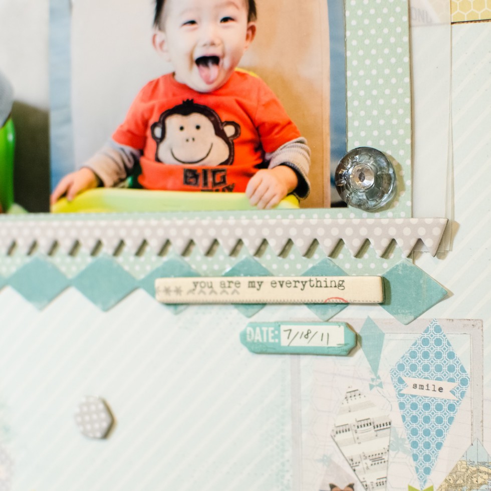
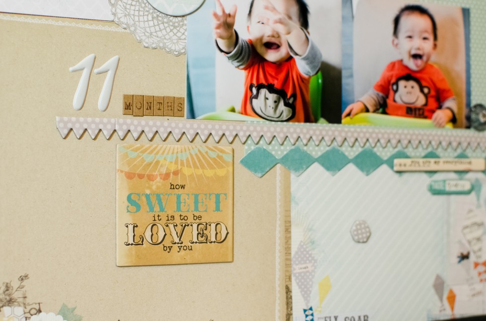
Lately there have been a lot of people on 2peas forum asking what to do with 6×6 paper pads. I recently got my first 6×6 pad of My Mind’s Eye – Follow Your Heart collection, wanting to try out the smaller-scaled patterns and to reduce paper waste. I also saw this card layout from kesiArt blog and fell in love with it, and wanted to change it into a 12×12 layout.
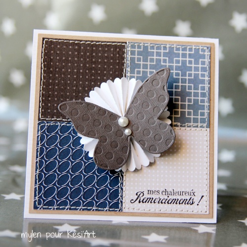
Although it seemed like an easy idea, I pondered on this design for a long time… 5 weeks to be exact. Where would I put my photos? Smack down in the center like this card? But I like multiple photos layouts. Do I put four photos in the middle? But that’s like 4 on 4, much too square to my liking.
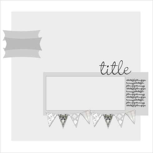
Then I saw this beautiful sketch from Elle studio:
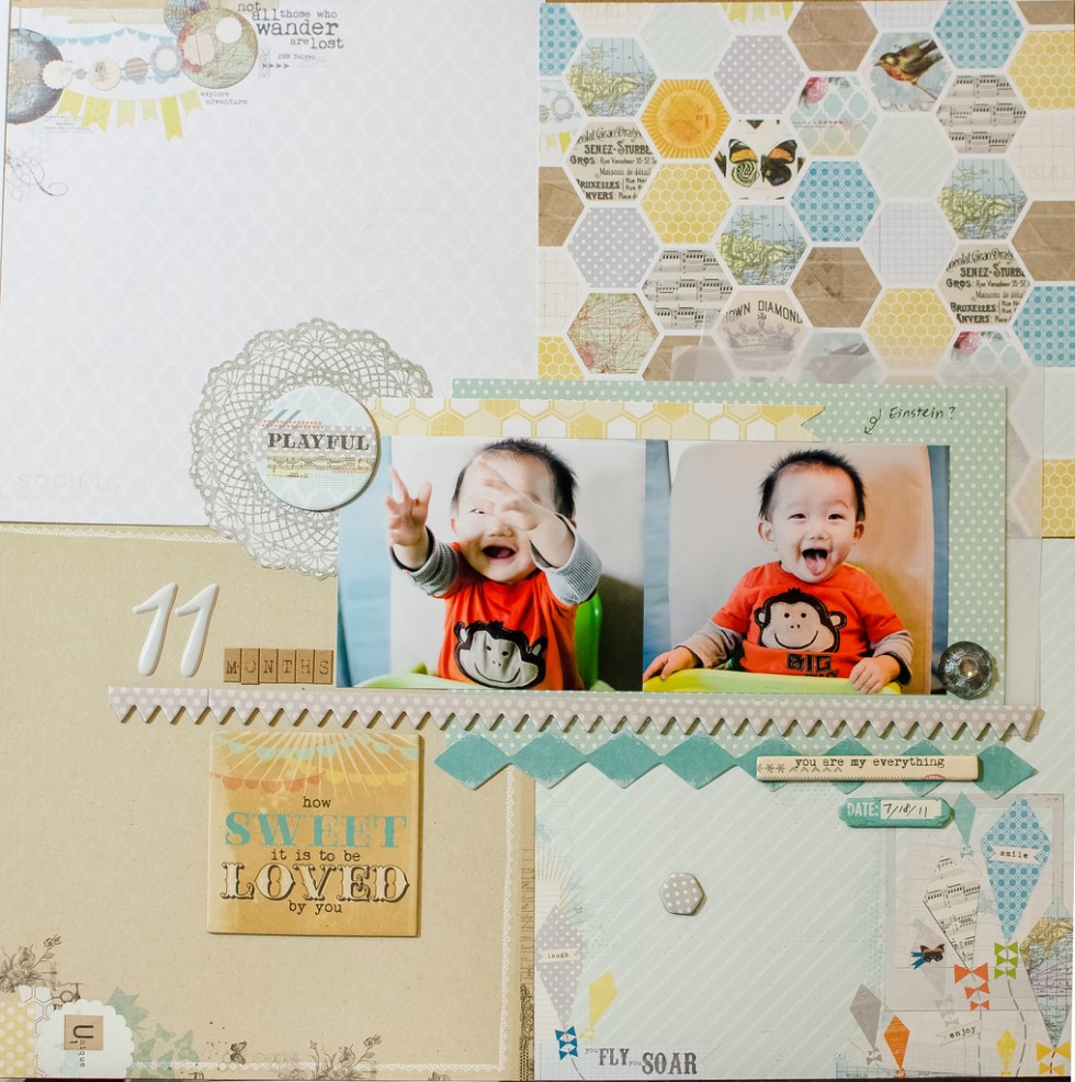
As soon as I saw that, I decided I’m just gonna ignore the quadrant design and lay my photos wherever I want as if using a plain background. In hindsight it’s an obvious solution to an easy problem. What was I thinking this whole time? So here it is, a very simple layout that I thought hard and long for 5 weeks!
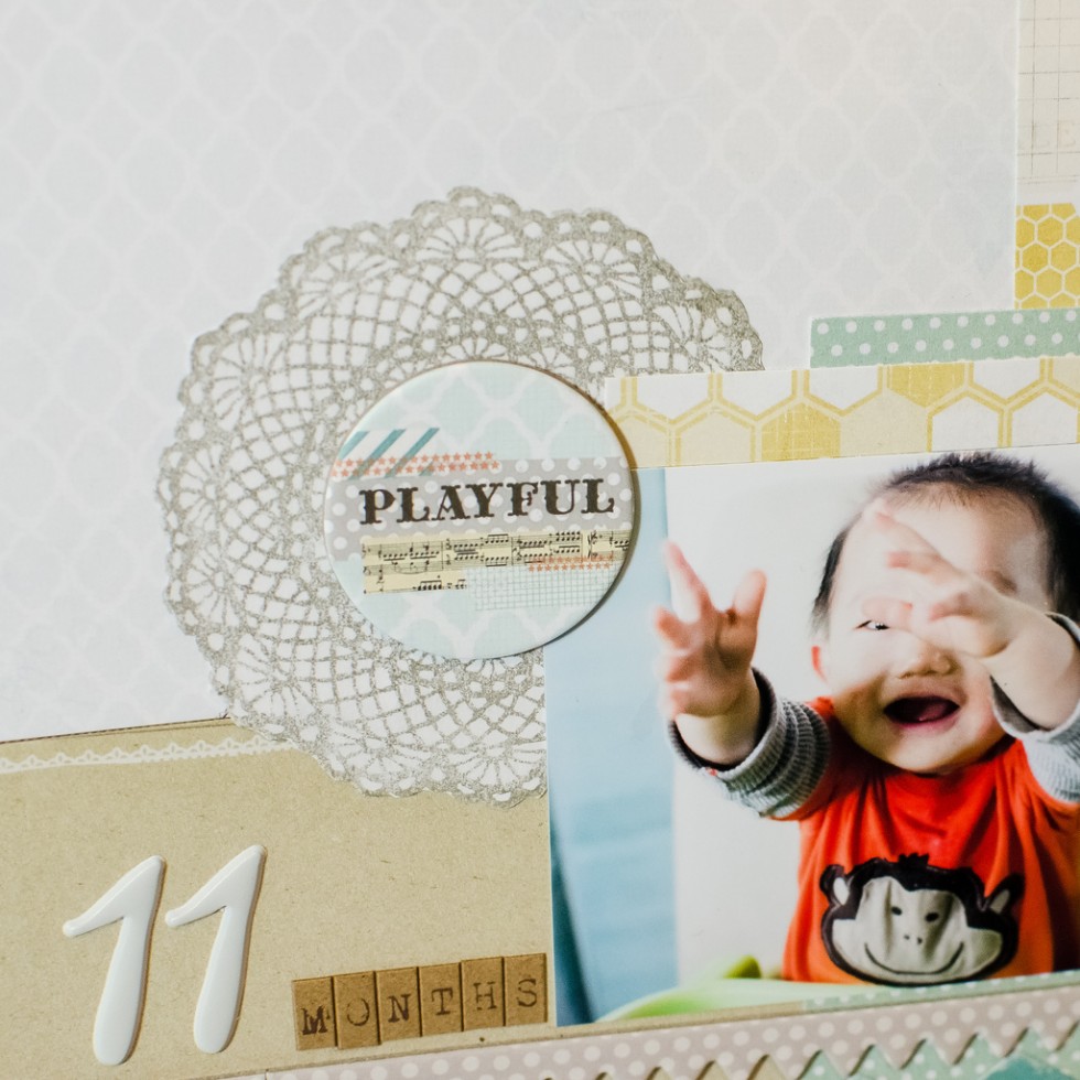
Can you tell this stamp was stamped on a piece of paper and cut out? My original stamp on the background was messed up, so I used this trick to cover it up.
Simple as this layout, it was still somewhat time consuming to carefully align the 4 mini paper onto the background cardstock. A much faster way… you know what, it’s half an hour past midnight, I can barely keep my eyes open, and my son is probably gonna wake up crying soon. So I’m going to leave this post here and make a separate post tomorrow. Stay tuned!
Supplies:
-Pretty much everything you see is from My Mind’s Eyes Follow My Heart collection, 6×6 paper pad and a sheet of chipboard elements


So cute! I really love this idea. I have plenty of 6×6 stacks that are just laying to the side not being used.
Adorable layout and the photos are precious. I love my 6×6 paper pads and finding ways to use them in my 12×12 layouts. This is a great idea! Thanks for the inspiration.
I can so relate to thinking and pondering a layout!!! I love what you have done here!
Your “error repair” was a great one… it added some wonderful color balance to a very fun and happy l/o.
Great card and layout!! Love the pictures.
Beautiful! No one would have known you made a stamping boo-boo. The coverup looks purposeful!
These are great!
Here is the link to the picture of the mini frittatas in the picture on my blog. :)
http://pinterest.com/pin/111534528241704144/
Thanks for leaving a comment. Your site (and work) is lovely!!
Some layouts may look simple but I know from experience that the ‘thinking’ can take a lot of time… so you’re not the only one! I love the way you put the photos – it make it really ‘finished.’ And such a sweetie-pie… aah… have a happy weekend!
I love the quadrant background. I just did a layout like this recently and loved it as well. Love your balance of patterns as well.
Beautiful layout. I love 6×6 paper pads.
Absolutely adorable! Love how you used the 6×6 paper :)
Great layout. I like how you combined the two sketches. Awesome.
Thank you for leaving me such sweet comments on my blog.
To answer your question, I am not totally sure how long it took me to colour the background paper I stamped. I was watching tv at the time. 1.2 hour to an hour I am guessing.
[…] Two Ways to Use 6×6 Paper On A 12×12 Layout, Part 1 – { 11 Months } […]
I really love this. I have to try this. You mixed everything so artfully.
Hi…thank you so much for the kind comment on my ‘summer bloom’ layout. You were asking about the source of the photo. I’m not sure. I looked back on Pretty Little Studio’s blog, and it wasn’t there either. Perhaps you could send them an email and ask. BTW – this layout is adorable. Love the MME product :) and the design is simple, yet elegant.
Uuuh love this layout!!