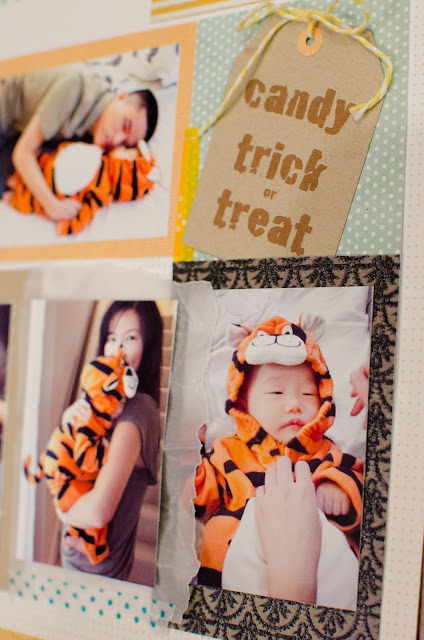
Halloween Layout
This is a layout I did for my son’s first year album, Halloween 2010. He was such a little thing — cute, obedient, easy going, and didn’t know what’s going on. He’s now one and half years old, but has entered into the terrible two stage since his first birthday. I suppose “terrible two” starts at 1 year + 1 day? Not at the 2 year mark? I know I know, I shouldn’t complain because a year from now I’ll say the same thing about right now. I know he’s still a cute little thing, and he’ll only get naughtier as he gets bigger. I love him to death no matter what!
I thought I’d share my design or thought process here, something I long to see on other well-known scrappers’ blogs but seldom find. The first photo is my sketch in Adobe InDesign. I like doing my sketch digitally. This way I can print out the photos directly, to the exact size as I sketched. I duplicate-drag (alt+drag on Mac) the photos to a 8 x 10 page and print on a 8×10 photo paper. I can usually fit all my photos in a 8×10 paper. If not, I combine photos from other layouts or just save the leftover for next time.
 |
| Sketch in Adobe inDesign |
Here’s the result, pretty close as planned:
 |
| Pretty happy with the little round table I made in photoshop, glued with a 3D foam pop for dimension |
 |
| The gift tag was done in photoshop as well,and printed on the Bazzill Kraft cardstock. Hand cut, punched, and threaded. |
Since this is my first layout entry, I’d love to know what you think about it? Do you like how I shared the process? Too much or too little info? What would you like to see? I am not the most artistic or creative person, but I’m good in technology and organizing my workflow so I can achieve more in a short period of time. I hope I have something to contribute to the “memory keeping” community.


