DIY Embellishment with Pattern Paper {Chinese New Year}
I’m still not sure what’s the best system for the post titles. My blog posts are not always about the title of the layout. I hope to talk more about my process and techniques (or the lack of) for the layout. How about “Title for the post content” + “title for the layout in curly brackets”? Let’s see how I feel about that, and please share what your naming system for your blogs are!
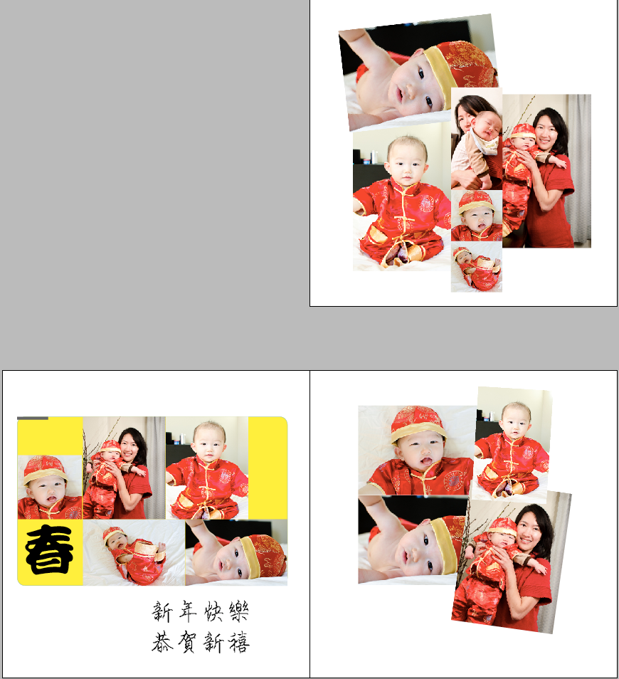
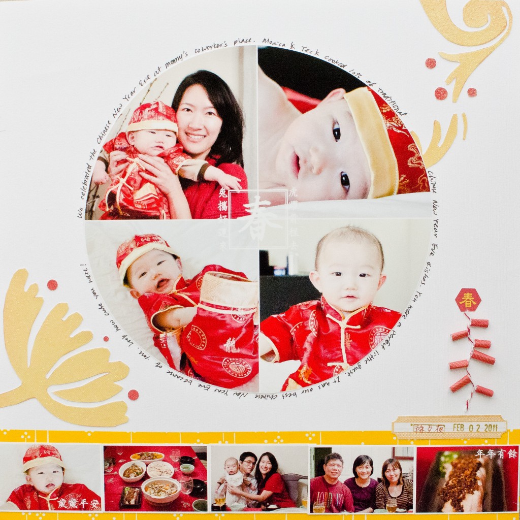
I struggled with this layout for a long time. I did 3 sketches in InDesign before I decided to do a circular layout with a square text block in the center. In Chinese culture, the shape, exterior circle + interior square, refers to how one should be flexible and courteous when dealing with others, while not forgetting virtues, principles, honesty, and whatever qualities good samaritans should possess. How about that for a scrapbook design?
But I have a lot of photos for the event, and a circle can only accommodate 4 photos. After days of struggles, I decided to add a photo strip at the bottom. I think it tips the balance of the layout a little bit, but hey, it’s the scrapbook for my son, who won’t care about good designs when he browses the photos in the future. I’ll even add a divided photo page in the album to house the rest of the photos that didn’t make to this page.
 After all the photos were cut and arranged on the white cardstock, I was at my wit’s end for embellishments. All the embellishments I have are too romantic, vintage and non-Asian for this layout. There isn’t any embellishment that is done tasteful when it comes to Asian stuff, in my humble opinion. Even if they do exist, I wouldn’t buy them for just one-time use, or worse, use them for all future chinese new year layouts.
Finally I found a pattern paper that had a big yellow floral design. Big floral is a timeless and universal design that can be applied for anything, and the yellow is perfect for my photos. I cut out the flowers with scissors (wasn’t an easy task!), arranged them on the cardstock, but the layout still looked empty.
After a good night’s sleep (a relative term, considering I have a toddler who still doesn’t sleep through the night) I woke up with an idea. How about I make a string of red firecrackers! Once I settled on that idea, everything else came easy. I rolled up a piece of red pattern paper, cut it into smaller chunks. A piece of red twine was glued down to the cardstock with diamond gaze, and the firecracker rolls were then glued on according to the curve of the twine. The top hexagon thing, which is what firecrackers are usually hung on, was made by in Photoshop.
I journaled around the circular focal point in black to further anchor it down, and yellow washi tape served as the background of the photo strip. The layout that consumed me for a week is finally finished!
Supplies:


love this! your embellies are great and the circle is perfection!!
This is lovely! It came out fabulous and I like the photo strip :)
This is adorable! (SUPER CUTE BABY), also, and I LOVED how you made the firecrackers! What a great idea!
I also loved reading about the traditions and how you used them to come up with your design! love Penny Scrap-aholic@blogspot.com
You did a wonderful job! I love the end result.
Love the firecrackers! A perfect touch! Those photos are adorable!!! The red just pops!
Your layouts are stunning.
I really like the journaling around the cirlce.
Everything about this layout is great