Overlay – { 7 months }
Off topic: Whew, did 20 minutes of Jillian 30-day shred today. Good me. *pat on the back*. I owned the DVD for over a year, and I’m still at level 2, and it still kicks my butt! I mentioned it here because I hope by talking about my workout, I’ll motivate myself to move more. Let’s see if it works. Would love to hear how you keep in shape too, especially you working moms. Now, back to my scrapbook.
When I first seriously started scrapbooking, somewhere during the second half of last year, I bought a bunch of very themy baby boy supplies. I was also obsessed with die-cut papers (think bracket shape) and overlays. Fancy Pants’ Baby Mine collection fit my needs at that time. But once I had the products in my hand, I realized they were harder to work with than I imagined. Do you see a lot of cute baby boy themed papers in my previous layouts? Nope. In the Unachievementslayout I forced myself to use the round die-cut paper, and it was like pulling hair. Die-cut paper was too restrictive for me and I was happy when done with the paper.
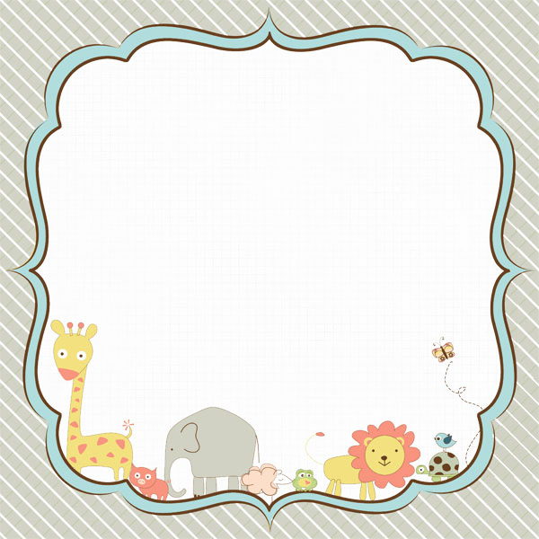
This 12×12 overlay was no exception. I thought it was ingenious when I purchased it, but layout after layout I kept pushing it aside. I forced myself to use this up before my new order comes in.
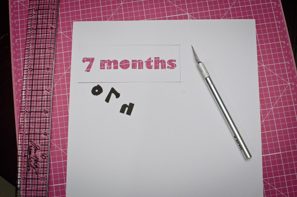
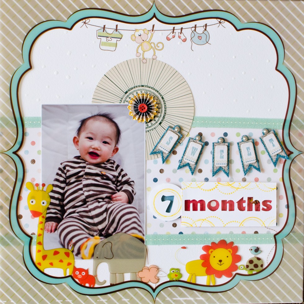
There’s no need to plan ahead since the transparency dictated the style of the design and defined a clear border. Feeling uninspired, I thought I’d make my own negative title that I’m seeing more and more. By negative title I mean the letters are cut and discarded, and the frame with the carve out space is used instead. Being a dining table scrapper, of course I don’t have a die cut machine. I printed the letters reverse (I think mine is called “flip horizontally” in the print dialogue), and used my handy little xacto knife to carefully removed the letters without damaging the paper.
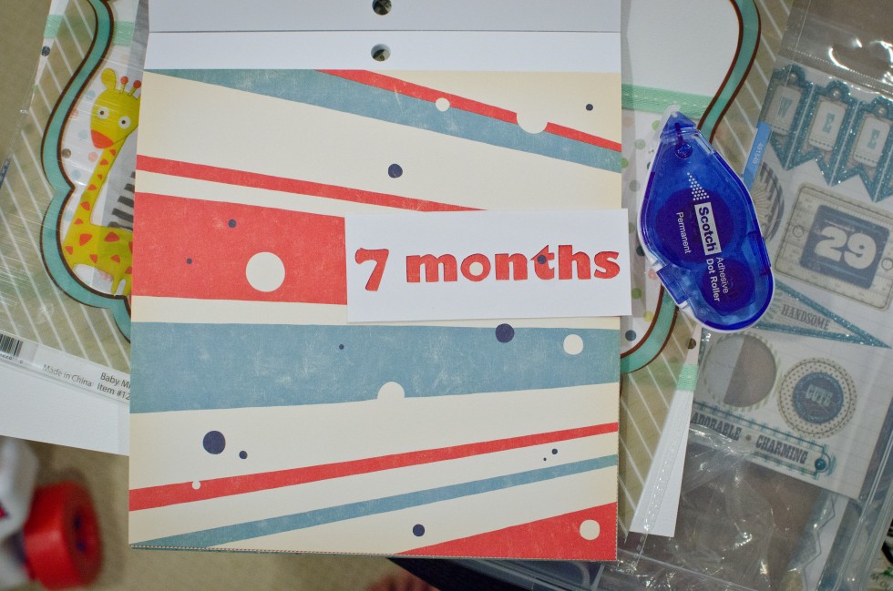
Then I looked for pretty pattern paper to line the negative space. I grabbed October Afternoon’s Rocket Age 9×9 pad, and I liked the result a lot.
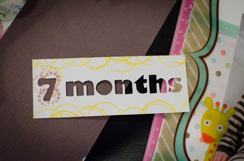
I was so happy I started stamping on it, because the white cardstock looked stark white against the tan-colored transparency. Well, I’m not a good stamper, obviously:
Umm… what was I thinking? Ha! I was willing to live with “months”. So I just redid “7″ and that’s why 7 ended up in its own circle, and the ugly yellow stamp remained. Mental note: do not attempt stamping again on xacto’d pieces.
Although I’m not crazy about the title art, I like how I combined a hodge podge of styles and manufacturers. I always combine brands, but I’ve never mixed styles this different before. The big circle is Jenni Bowlin I think. It was my first give-away win! The style is very vintage — it’s a clock face. The green ribbons were from American Craft Chaps. The rosette was from Chaps too. And the “SWEET” embellishment was My Mind’s Eye Lost and Found Two, yet another style (shabby chic?).
I’m glad I still had fun with the layout, being able to mix all sorts of styles. Was it apparent to you or did it bug you that all the elements are different styles? I better get some sleep now since I worked out tonight. Hope you enjoyed this post, and would love to hear your feedback!
EDIT:
I just realized I forgot to mention the little dots I added using Ranger’s Enamel Accents. It’s not that obvious but they’re small white dots on the white cardstock. The Ranger’s Enamel are 3D, kinda like liquid pearl but it’s matte. They are much more noticeable in person, and I think they add some interest to the otherwise boring white background.


Aw! This is just to cute. Love the transparency you used. I really like how you did the title.
Beautiful page! That’s some intricate exacto work and it looks great!
This turned out great!!! Love the way you worked with that die cut piece – I have trouble with those too.
So very cute!!
It turned out wonderful, so cute and I love the mix of different brands, styles..it works!
Great layout! I love that Fancy Pants line too.
Lovely layout! So fun!!!
Hi! You asked a question on my blog…and thought I’d answer it here (otherwise you might not see it)! The NOMA page of my journal was embellished with some cut-outs from an old Somerset magazine. I knew I would use them one day. They do look so dimensional! ;)
Fun LO! Oh my goodness your baby is adorable. I want you to turn back time and let me hold him at this age. :D <3 <3 and I'll have to teleport to do it, of course.
I, for one, think it turned out great!! And the picture looks amazing! You did a great job challenging yourself :)
Beautiful and I love the step through and all that stamping…just beautiful
Oh my goodness this layout is so beautiful.
That photo is adorable. I really like the banner ;)
Just wondering how the 30 day shred is coming along ;)
nicelayout and great use of the transparency!!
really good work with the title !!
i’m jealous !! ;)
I know you say that you hate the yellow stamped area, but I totally love it! I think you did an amazing job on this layout and the photo is totally adorable!
I was drawn to this layout, so even if you think it looks mixed up, it’s stunning.
Wow, this is a beautiful layout! Great job with exacto too.
Thanks for stopping by my blog & leaving a message today :D I really appreciate it!
I really like the page! I also like how you shared your struggle with the materials. I often feel that way about theme stuff and have avoided buying it. I tried a December Daily album for the first time last year and found I really liked the smaller format so that may be the only way I can use them. I saw this page in your gallery and thought WOW love that transparency! LOVE that large circle too- great combo and design- and by the way- totally impressed with your Xacto knife powers! The page looks great!