
Celebrate Failure
An accounting firm I used to work for had monthly meetings called “Celebrate Failures”, where teams shared their failure experiences, like lost engagement proposals or lost clients. The partners explained that people don’t like to talk about failures, which is a pity because often times you learn more from them than success. Hence we should gather and talk about failures and celebrate that we learned lessons from them. I thought it was a boat load of baloney, among other things like no open toe shoes allowed, no sleeveless tops, or jeans only on Fridays IF you make a $5 donation.
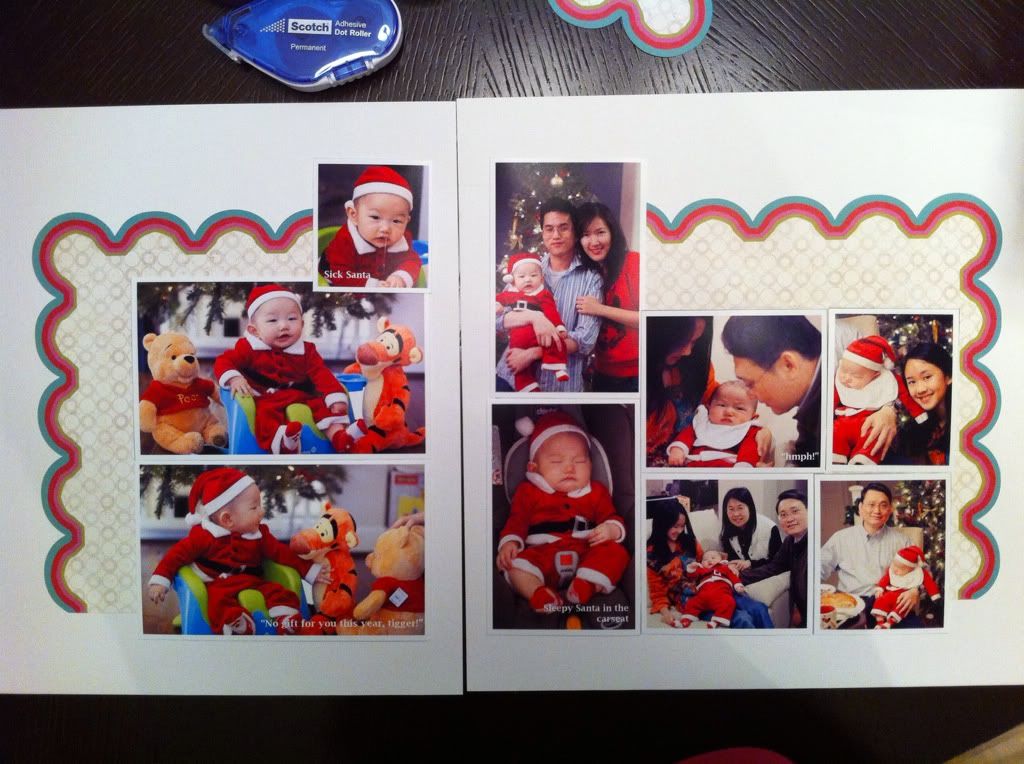
This layout, my son’s first Christmas, reminded me of the term though. I spent several nights sketching various maps on paper and adobe InDesign, before narrowing down to 2 layouts, and finally settled on one of them. I cut up the die-cut paper I ordered specifically for a Christmas layout, for its red and green scallop edge, and glued the parts down. 9 photos of various sizes according to my sketch were printed and cut. I picked out the rest of the pattern paper and embellishments, and was going to glue everything down the following night.
The next day I had buyer’s remorse. The more I thought of the layout, the uglier that die-cut paper became. I debated with myself a whole day in the office, and even posted a forum thread on two peas in a bucket for opinions. Everyone told me to redo it. I liked their answers, although I thought it was a waste of all my time and a waste of the supplies, ink and paper. I was going to toss everything and reprint all the photos, fortunately I figured out a new configuration with the same photos. Anyway, here’s the ugly layout that I later regretted:
 |
||
| the die-cut paper: Crate Paper, snow day collection. It was my first Crate Paper paper so I really didn’t want to waste it. |
The red/green die cut paper was glued, but good thing the photos weren’t.
I tore the diecut paper, rearranged the photos, and here’s the final layout, which I’m quite pleased about-

 |
| I wasn’t going to make a title, since it’s obvious what this layout is about. But the empty space seemed to call for something, so I used the minimalist style title. |
 |
| It was my first stamping attempt. Yup I didn’t practice first, and this is what happened. Oh well. |
Much better, I think, at least at the moment.
I’m so glad I redid it before I glued everything down. Now I know, when in doubt, redo it, the earlier the better. Layouts are to stay with us for years to come, and material costs are just a few bucks.
Paper for most punched circles – DCWV Citrus Stack
 |
I like your style. Less is more usually gets my attention. I also like your writing style. Interesting and fun!!
Beautiful pages – love all the photos that you pack into them.
It's beautiful, i like the simplicity of your layouts!
Great LOs!!! Love them!
Lovely double page layout!!!
I love the way your LO came out, it's beautiful. When I think of "mistakes" I am remind that there are no mistakes in art, just variations.